CSS Shadow
With the latest CSS version CSS3 we were introduced on a major scale to the world of CSS Shadow. On January 13th 2015 Firefox officially enabled full support for CSS filters which allows developers to abandon old methods and conquer the new. In celebration of this I have concluded a post which contains examples of great CSS Shadow effects and how to use them.
There are thousands of usage points with filters and one of the best is CSS Shadow. In order to achieve the effects of shadows in web design we may use text shadow, drop shadow or box shadow. The best case is if you can make a plain image and apply CSS Shadow to that and not create the picture with the shadow. This creates amazing effects on differently scaled and sized devices.
CSS Shadow Examples #
I have gathered some great examples of the usage of CSS Shadow in a form of Text Shadow, Drop Shadow and Box Shadow. These all create the fantastic effects which we are looking for.
I have commented a description of the attributes and how tou use the styling. By using CSS Shadow you enter yourself into the new world of web design. If you have questions or would like get a good example of some different CSS Shadow on this page, please make a comment.
Text Shadow #
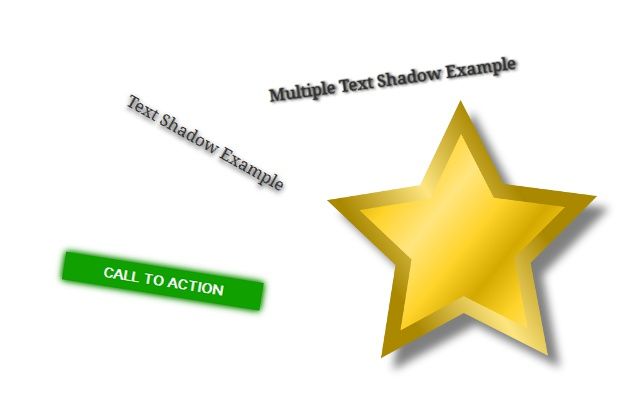
Text Shadow Example
text-shadow: 1px 2px 4px #000; // horizontal vertical blur color
Text Shadow is a CSS Shadow which gives the text a proper shadow effect. This does not work on IE9 but IE10 does support it. Here is an example.
Multiple Text Shadow Example
text-shadow: 2px 1px 2px #000, 0px 0px 1px #000; //horizontal vertical blur color
Multiple shadows are created by applying multiple rules into the CSS line. This can give the text a more 3D feeling or a very nice color effect.
Drop Shadow #
With drop shadow you can achieve great effects like taking a logo or a symbol out of a background and bringing it to life. Drop shadows can be done by a special filter. Box shadow can be a backup for IE9 users but the truly great drop shadows for modern browsers are done by using the filter tag. This filter tag will create an amazing drop shadow which will follow all the lines of the targeted element.

-webkit-filter: drop-shadow(12px 12px 4px rgba(0,0,0,0.5));

filter: drop-shadow(12px 12px 4px rgba(0,0,0,0.5)); // horizontal vertical blur color
If you are using Firefox and don’t see the CSS Shadow effect, then you are using an outdated version. Because on the version 35.0 Firefox added the support for drop shadow filter. An outdated version of Firefox drop shadow is created by using filter which makes an SVG Shadow outlining the target.
filter: url("data:image/svg+xml;utf8,<svg height=\\'0\\' xmlns=\\'http://www.w3.org/2000/svg\\'><filter id=\\'drop-shadow\\'><feGaussianBlur in=\\'SourceAlpha\\' stdDeviation=\\'4\\'/><feOffset dx=\\'12\\' dy=\\'12\\' result=\\'offsetblur\\'/><feFlood flood-color=\\'rgba(0,0,0,0.5)\\'/><feComposite in2=\\'offsetblur\\' operator=\\'in\\'/><feMerge><feMergeNode/><feMergeNode in=\\'SourceGraphic\\'/></feMerge></filter></svg>#drop-shadow")
This was a very good way to create drop shadows but since Firefox now also supports filters by default, it is a bit unnecessary. Please update your browser in order to enable the latest technologies.
Box Shadow #
With box shadow you can create boxy styled CSS Shadow. So it is perfect for rectangle like object, and not so good for rounded or oddly shaped objects. But it also supports more than one shadows, so you can create amazing effects like this glowy call to action button. This is created with two different shadows separated by a comma in CSS code.
Call to action
box-shadow: 0 0 5px #108000, 0 0 8px #109600; // horizontal vertiucal blur color
- Previous: Best Blogging Platform is WordPress
- Next: Windows, Mac, Linux