HTML5 Responsive Design Guide and Skeleton

Have you ever wondered how to do these websites which work on desktop computer, tablet and even on mobile phone.
This guide is all about Responsive Web Design in HTML5 which allows this extremely powerful design since you only do one website instead of three platform specific ones.
Responsive Design #
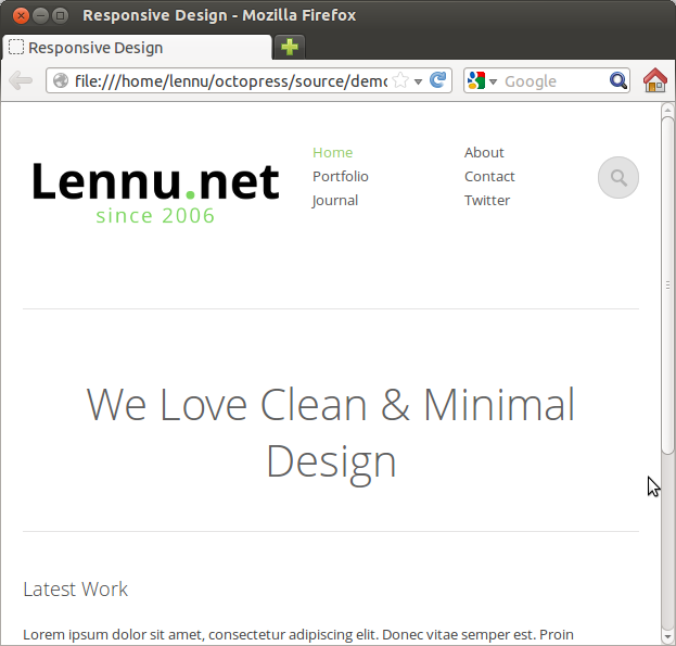
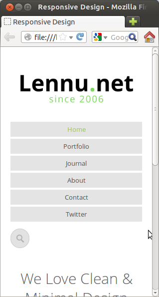
Have a look at this web page. If you use your mouse to resize the window you’ll notice that the page changes according to the size of your window.
Maximum resize.
Average resize.
Minimum resize.
Magic in the CSS #
The answer how to do this is in the CSS code of the web page. If you dig to the code you’ll find these statements:
@media handheld and (max-width: 480px), screen and (max-device-width: 480px), screen and (max-width: 767px) { }
and
@media handheld and (max-width: 479px), screen and (max-device-width: 479px), screen and (max-width: 479px) { }
So what these basicly do are optimization for different handheld devices. And it works just by giving these statements in the CSS code and writing special code in them which will be used when the window size is in the required region.
The magic is that these statements override the normal CSS settings when window size is small enough. So you them with that logic.
Tablet structure #
@media handheld and (max-width: 480px), screen and (max-device-width: 480px), screen and (max-width: 767px)  {
	body{
		padding:0 20px;
	}
	header .main-nav {
		margin-left:4%;
	}
}
On this example code we give tablet version of the page some padding and give main-navigation margin. Which does the effect that page works better on tablets.
Mobile Phone structure #
@media handheld and (max-width: 479px), screen and (max-device-width: 479px), screen and (max-width: 479px)  {
	body{

	}

	header #logo {
		text-indent:-99999999px;
		width:244px;
		height:75px;
		float:none;
		margin:0 auto 40px; auto;
	}
	header #logo a {
		background:url(../images/logo.png) no-repeat;
		display:block;
		width:244px;
		height:75px;
	}
	header {
		border-bottom:none;
	}

	header .main-nav{
		width:100%;
		margin-left:0;
	}
	header .main-nav ul {
		width:100%;
	}
	header .main-nav ul li, header .main-nav ul > li.last{
		display:block;
		float:none;
		text-align:center;
		width:100%;
	}
	header .main-nav ul li a{
		padding:4px 0;
		background:#e4e4e4;
		display:block;
		margin-bottom:4px;
	}
	div.columns{
		width:100%;
	}
	div.one{
		margin-left:0;
		width:100%;
	}

	header #searchform {
		float:right;
		margin-top:10px;
		width:100%;
		margin-bottom:20px;
	}
	header #searchform #s {
		border:1px solid #cecece;
		width:16px;
		-webkit-border-radius:40px;
		-moz-border-radius:40px;
		-o-border-radius:40px;
		border-radius:40px;
		padding:10px;
		background:#e2e2e2 url(../images/magnify.png) no-repeat  50% 50%;
		-webkit-transition-duration: 400ms;
    -webkit-transition-property: width, background;
    -webkit-transition-timing-function: ease;
    -moz-transition-duration: 400ms;
    -moz-transition-property: width, background;
    -moz-transition-timing-function: ease;
    -o-transition-duration: 400ms;
    -o-transition-property: width, background;
    -o-transition-timing-function: ease;
		cursor:pointer;
		color:#4b4b4b;
		text-indent:-999999px;
	}
	header #searchform #s:focus {
		outline:none;
		background:#e2e2e2 url(../images/magnify.png) no-repeat 4% 50%;
		padding-left:34px;
		width:90%;
		text-indent:0px;

	}

	.copyright, .footer-nav{
		width:100%;
		float:none;
	}
	.copyright,	.footer-nav {
		text-align:center;
	}

	#main-content .text-intro h2 {
		font-size:30px;
	}
}
On this example we do alot of stuff to the optimization for the mobile phone. Largest change is the navigation which we give a whole new life with with completely new CSS codes. We also change alot of the heights and widths to go with phones screens.
- Previous: Finnish Education System
- Next: Import Git Project into Eclipse